How has the Miami Dolphins team logo changed?
The Miami Dolphins are a professional football club in the United States, founded in 1965. They currently compete in the East division of the National Football League (NFL). The team’s home stadium is the Hard Rock Stadium, and their head coach is Mike McDaniels. The franchise is owned by Stephen M. Ross.
The Miami Dolphins have wisely updated their logo while preserving key elements and the vibrant color palette of their original design, maintaining a strong connection to their heritage and pleasing both long-time and new fans.
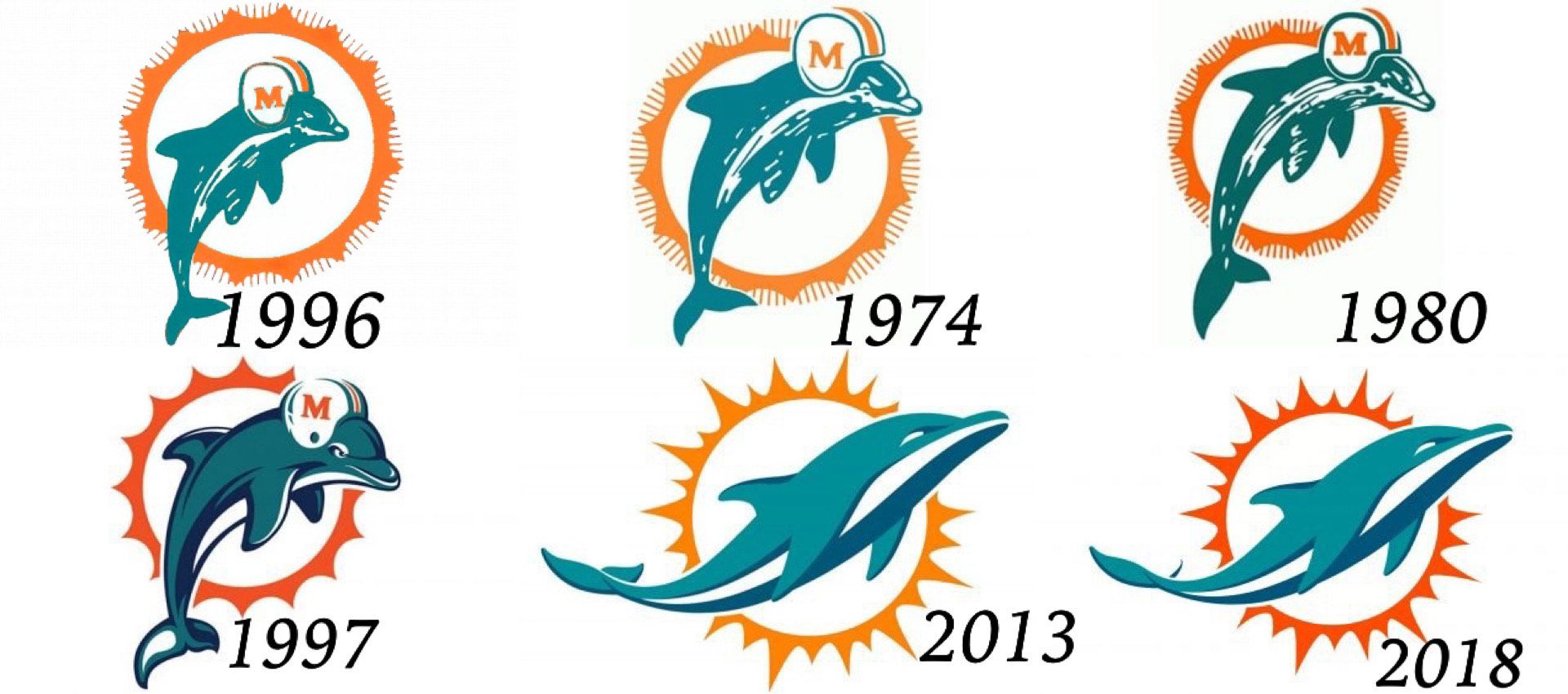
From 1966 to 1974, the original emblem of the Miami Dolphins showcased a prominent white sun with an orange ring and multiple rays encircling it. Positioned vertically over this abstract sun was a friendly, smiling dolphin wearing a white and orange football helmet. The dolphin was depicted in a vibrant turquoise color, symbolizing creativity, kindness, and gentleness, while orange represented energy, passion, and speed.
Between 1974 and 1979, the Miami Dolphins’ logo underwent a subtle refinement. The changes included an enlargement of the dolphin’s figure and its helmet. The white helmet with blue and orange stripes now featured a more prominent and visible orange “M” with serifs. Additionally, the contours of the sun rays were cleaned up, and the lines were elongated for a crisper appearance.

From 1980 to 1996, the Miami Dolphins’ iconic visual identity underwent a minor redesign. The changes included elevating the color palette by deepening and darkening the orange, and shifting the turquoise shade to have a more prominent green tone. Additionally, the orange “M” on the white helmet underwent a typeface change, becoming bolder and more substantial compared to the previous version.
Between 1997 and 2012, the Miami Dolphins introduced a fresh and modern logo. The dolphin and sun were redrawn with thicker lines and added dark blue accents. The mascot’s face and helmet became more detailed, and the “M” and stripes were cleaned up. The sun’s silhouette was simplified to a bold circle with pointed elements. Another version featured the dolphin on a white background, holding a white football with four orange lines for added speed and power.
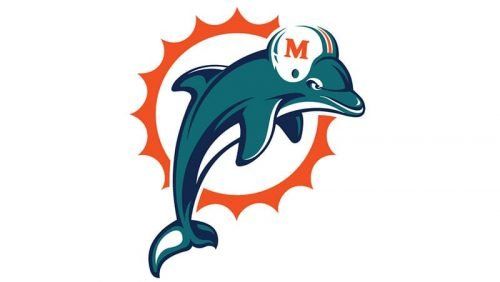
From 2013 to 2017, the Miami Dolphins underwent a rebranding, adopting a new logo. While it was rooted in the original version, both the sun disk and the dolphin’s contours were cleaned up and modernized to symbolize the club’s progress and growth, giving their visual identity a contemporary touch. The dolphin was now depicted without a helmet and used a palette of turquoise, blue, and white. The sunburst also had some of its lines elongated and made sharper.
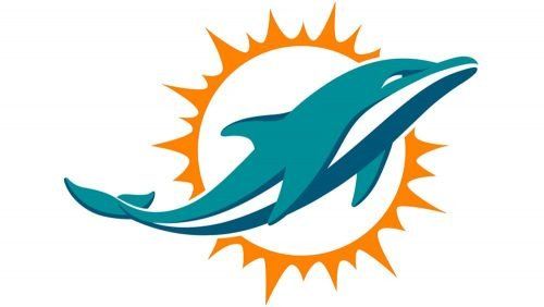
From 2018 to the present day, the Miami Dolphins underwent a redesign that primarily focused on their emblem’s color palette. The significant change involved darkening the shade of orange, bringing it closer to red. This adjustment to the color palette aimed to create a more dramatic and powerful look, ensuring strong contrast against a white background and making the Miami Dolphins logo more visually striking. This update has contributed to the logo’s modern and bold appearance.
